MY ROLE
Product Designer (UX/UI) & Web Designer
DURATION
From March 2025 – May 2025
TEAM
Product Designer (UX/UI),
Front-End Developer
SCOPE
Landing Page Redesign → UX Strategy, UX Architecture, Responsive Design

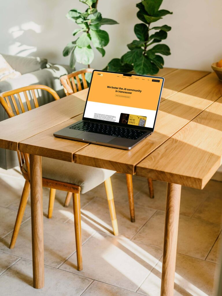
As UX Designer, my focus was on enhancing the overall user experience by clearly articulating VanJS’s identity, its purpose, tone, and community culture.
VanJS hosts monthly events for JavaScript enthusiasts, and I aimed to guide new visitors through a simple and intuitive journey that explains who the community is for, what it offers, and how to get involved. This included making it easier to discover and join upcoming events or connect on Discord, while designing a welcoming first impression that reflects the inclusive, vibrant spirit of VanJS.
Product Designer (UX/UI) & Web Designer
From March 2025 – May 2025
Product Designer (UX/UI),
Front-End Developer
Landing Page Redesign → UX Strategy, UX Architecture, Responsive Design
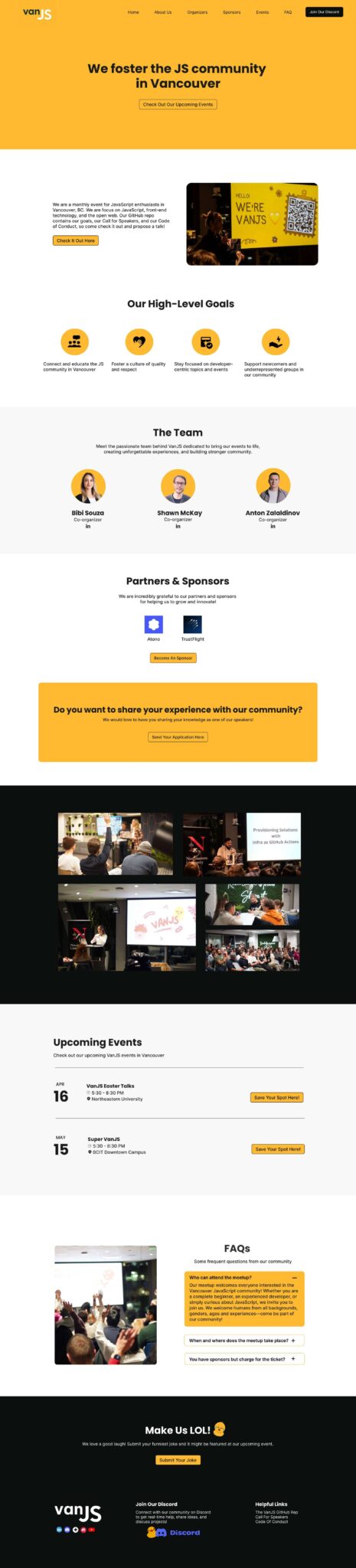
The original VanJS landing page did not effectively guide new visitors. It lacked a clear visual hierarchy, a defined narrative, and intuitive paths for taking action. As a grassroots developer community, VanJS required more than just a modern interface; it needed a design that would reflect its inclusive culture, communicate its purpose at a glance, and encourage genuine engagement.
The challenge was to enhance usability and improve event discoverability without compromising the minimalist, community-first identity that makes VanJS unique.
The redesign delivered measurable improvements in user engagement and community growth validating design decisions rooted in clarity and user-centred thinking.
Here’s what was achieved:
30%+ increase in new user participation in monthly events
25% reduction in bounce rate on the homepage
Significant improvement in visitor retention and return visits
Noticeable boost in engagement on Discord and social channels
Qualitatively, community members praised the site’s clarity, welcoming tone, and ease of discovering events. Many newcomers described the experience as “inviting” and “straightforward,” while longtime members appreciated the site’s alignment with VanJS’s inclusive, grassroots spirit.
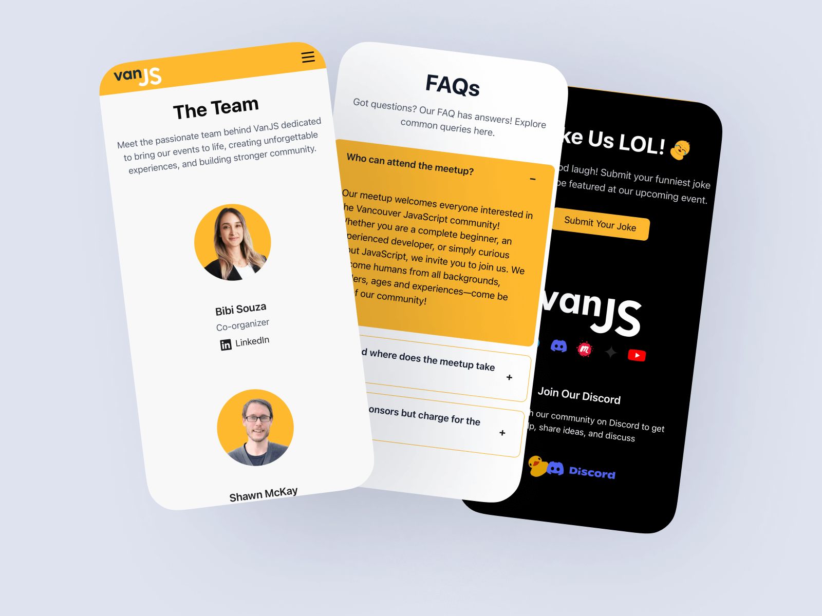
With over 60% of traffic coming from mobile devices, creating a seamless experience across all screen sizes became a top priority. The redesign introduced a fully responsive layout that adapts effortlessly from widescreen monitors to compact smartphones, removing barriers to participation and ensuring consistent engagement no matter the device.
This project enhanced my ability to design with clarity and purpose. I realized that even seemingly small decisions, such as refining a call to action or simplifying text, could significantly improve user engagement and reduce bounce rates.
Striking a balance between a minimalist identity and a clear, welcoming user journey encouraged me to be more intentional with every element on the page. It also reinforced the importance of defining and trusting my own design process: prioritizing what truly matters, designing for inclusivity, and aligning outcomes with community goals.
Ultimately, I learned that exceptional UX is not about adding more elements; it’s about ensuring that every interaction feels purposeful.
I hope you love it 🙂